http://www.breathingearth.net/
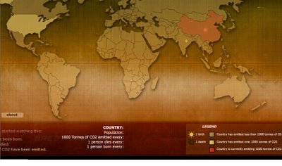
"A simple animated geographical visualization that shows the relative impact different countries have on climate change over the timeline of watching the application. Different icons represent the statistical data of countries in the context of its birth & death rate, and its carbon dioxide emission."
Oh, and the amazing most humbling part is that it's all in real time. So you are actually watching the Earth breathe.
No comments:
Post a Comment